How to Highlight Text in Canva: Easy Step-by-Step Guide
Learn how to effectively highlight text in Canva to enhance your digital content. This guide offers simple steps to make your social media posts, marketing materials, and designs stand out with visually appealing graphics.
Engaging the audience with visually appealing graphics is vital in the digital era, and a tool like Canva offers an intuitive platform to do just that in a few simple steps. One common design task is highlighting text, which can draw attention to key points, express emphasis, or simply make your design stand out. Whether you're looking to enhance your social media posts, marketing materials, or any digital content, learning how to effectively highlight text in Canva is a valuable skill.
With a user-friendly interface, Canva provides an array of options to highlight text that range from basic to advanced techniques. Shapes, varying opacities, and a multitude of colors give users the creative freedom to customize their text highlighting as needed. Understanding these features will allow anyone, irrespective of their design experience, to bring a professional touch to their creations. Let's dive into how to transform your text's impact with strategic highlighting.
Key Takeaways
- Effective text highlighting in Canva can significantly enhance your design's visual appeal.
- Canva’s variety of tools and templates enables users to apply customized highlighting with ease.
- Mastering text highlight techniques adds a professional quality to digital content.
Fundamentals of Text Highlighting
Highlighting text effectively in Canva or Canva Pro can draw attention to key messages and improve the readability of your design.
The Importance of Highlighting Text
Highlighting text serves to emphasize important information and guide a viewer's focus. In Canva, using a highlight can distinguish a text segment from its surroundings, making it stand out visually.
Text Tool Basics
Canva's text tool is the starting point to highlight text. Users access a text box and find options to adjust the size, font, and text color or gradient. Default settings can be changed to suit the design's needs, ensuring the highlighted section is prominent and aligned with the overall aesthetic.
Selecting the Right Font
Choosing the right font plays a pivotal role in text highlighting, as different fonts convey different emotions and levels of importance. A clear and legible font ensures that the highlight is effective. The font size should complement the highlight, making sure the text remains readable.
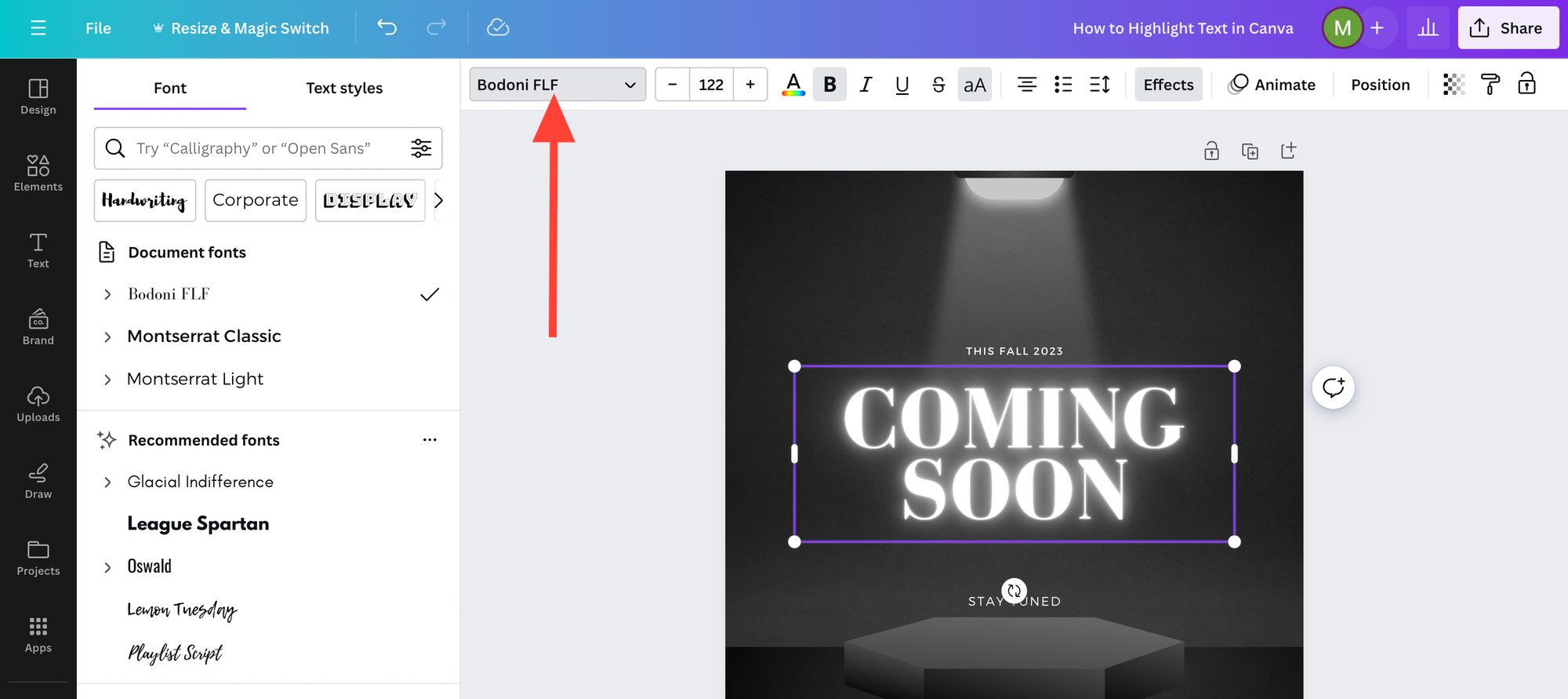
Customizing Your Text Design - Canva Tutorial For Beginners
When working with Canva, customizing text involves more than simply changing the font type and size. It encompasses a range of design elements like color, size, effects, and the addition of a background for enhancement. Attention to these details can elevate the visual hierarchy of text within a design.
Adjusting Text Size and Color
Selecting the right size for text ensures it catches the viewer's attention at the appropriate moment. Once a text box is selected, Canva provides a dropdown menu for font size which can be adjusted for visual impact.
- Color: Choosing the perfect hue is crucial. Utilize the color picker tool for precision, or enter a hex code directly to apply a specific shade.
- Default color: Canva presents a palette of default colors, but custom colors can be saved for consistent branding.
- Transparency: Adjust the slider to make the text more subtle or bold within the design.
Applying Text Effects
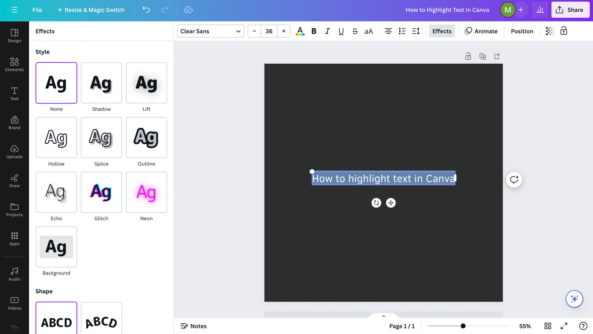
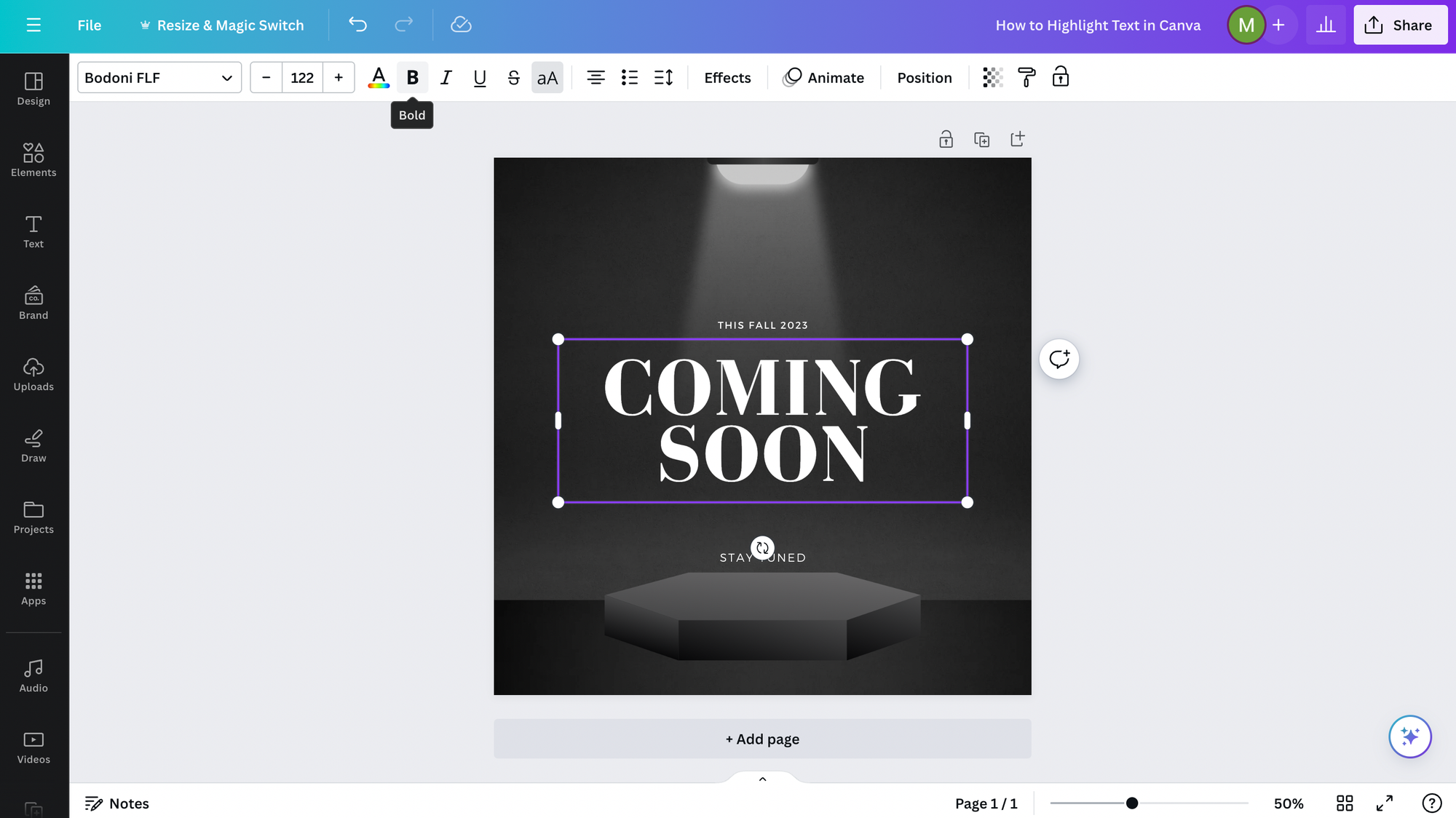
Canva text effects add depth and creativity to the message. They enhance the text by providing a three-dimensional look, shadows, or an outline.
- Select Effects from the text menu.
- Choose options such as lift, shadow, or neon to add dimensionality.
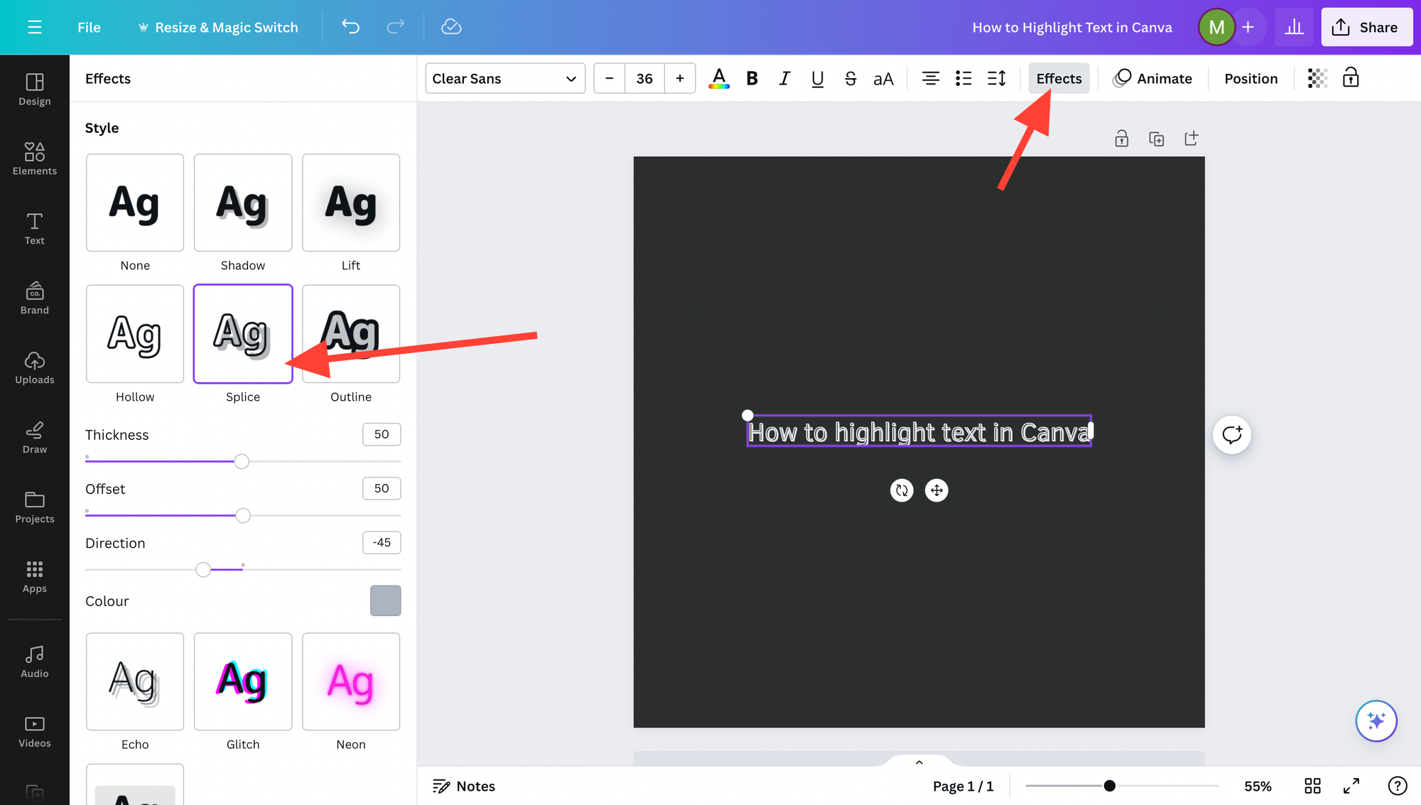
Effects can be fine-tuned with sliders that adjust the intensity, direction, and blur for a more controlled design.
Creating Text Background
A text background can isolate words from the design, making them stand out or synchronize better with other elements.
- To add a background effect, first click on Background in the edit toolbar.
- Shapes, such as rectangles or circles, can serve as textual backgrounds; simply adjust their color and transparency to fit the design.
- Shapes can be found in the elements section, and once added behind the text, they are easily resized, forwards or backwards - however you want, as well as colored to create a contrast or complement the text.
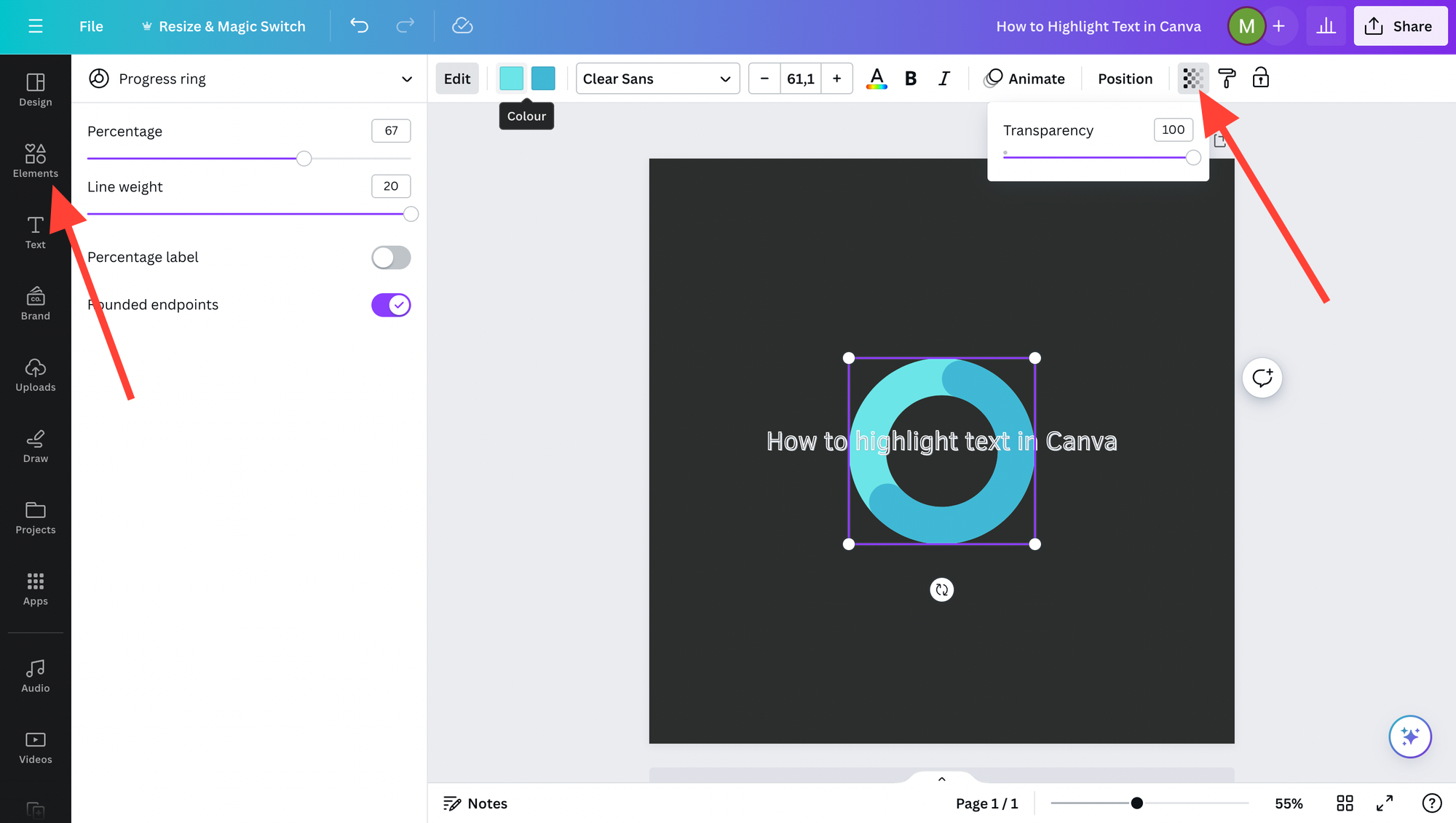
Incorporating these adjustments results in text that not only conveys information but also contributes to the overall aesthetics and effectiveness of the design.
Advanced Highlighting Techniques
Advanced highlighting goes beyond basic text features, allowing designers to use Canva graphics and effects to emphasize text creatively, for example.
Utilizing Shapes and Lines
Designers can enhance their text by using shapes such as rectangles, circles, and custom lines. Firstly, one may place a square behind the desired text, adjusting its size and color to create a contrasting background. This method is particularly effective for highlighting sentences or entire texts or paragraphs. For a more defined look, designers often set the roundness to soften the edges of the square, making the highlight fit more organically within their graphic design.
Similarly, lines can underline or strike-through text for added emphasis. Canva allows adjusting the thickness and color of lines, which means that they can be tailored to complement the design theme or make a strong visual statement.
Exploring Canva’s Effects Button
The Effects button in Canva introduces multiple options for text embellishment, for example you can even curve text. Designers can explore effects that add a background highlight directly to the selected text. This feature enables the artist to determine the spread of the highlight and allows subtle control over how the emphasis impacts the design.
Optimizing Text Layout and Appearance
In crafting compelling designs on Canva, one must consider the alignment and positioning of text elements for visual appeal, as well as use contrast effectively to enhance readability.
Alignment and Positioning
Alignment is a fundamental aspect of text layout that affects the coherence and balance of a design. Text can be aligned to the left, right, center, or justified, each lending itself to a different visual effect and suitability for various layouts. Ensuring the text is aligned consistently throughout the design aids in creating a clean, professional look.
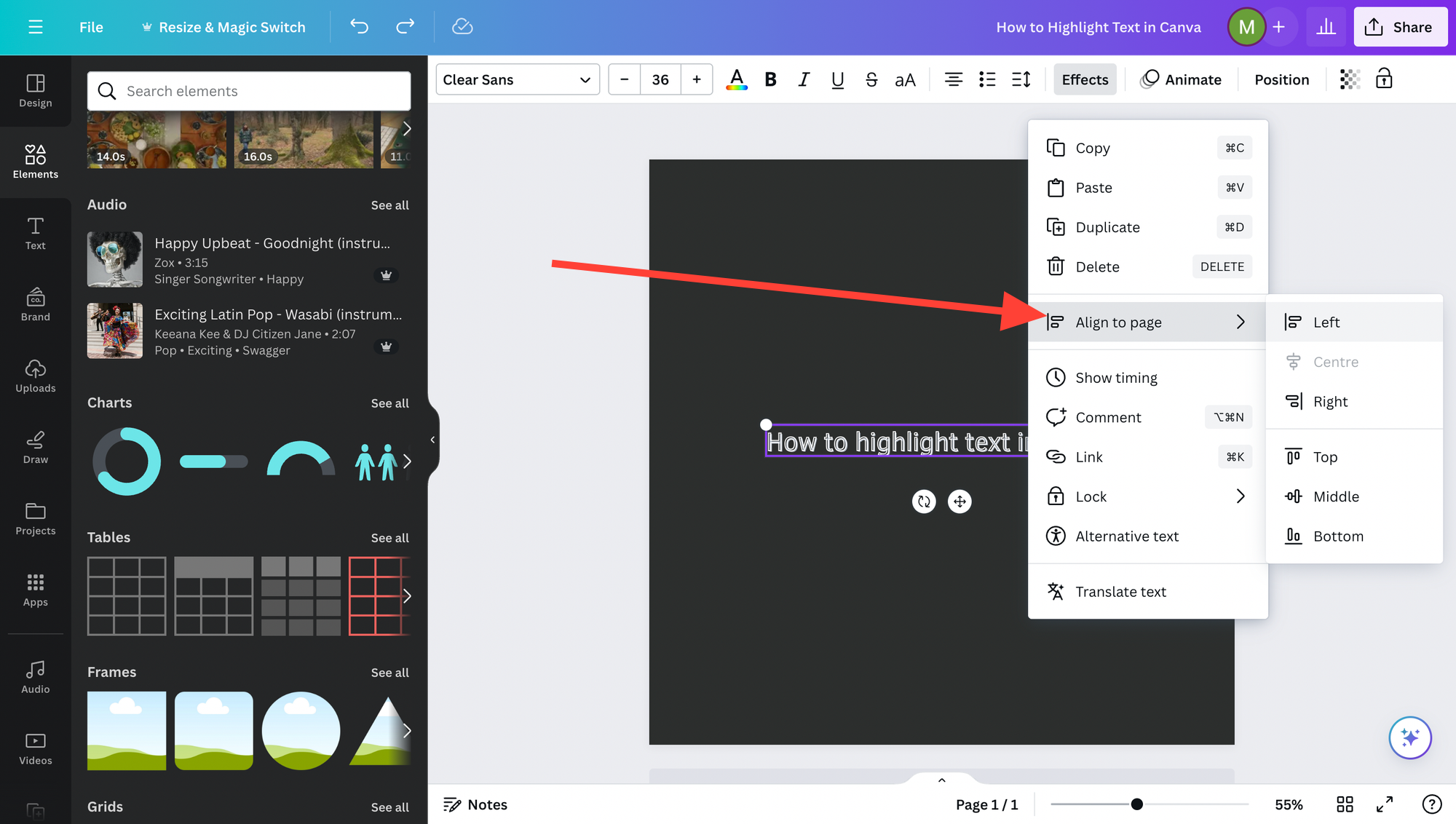
- Left Alignment: Ideal for body text, it creates a strong vertical line that aids in reading comfort.
- Center Alignment: Often used for headings to draw attention or to create a formal appearance.
- Right Alignment: Can be effective for short pieces of text that require focus.
- Justification: Provides a neat, uniform look but can lead to uneven spacing between words; use cautiously.
Positioning is equally critical, as it directs the viewer's eye flow throughout the design. One can use the positional tools in Canva to ensure elements are spaced proportionally and aligned to a grid or specific layout structures.
- Positioning options include:
- Top, middle, bottom
- Left, center, right
- Grid alignments for precise placements
Resizing text must be done while maintaining legibility, with headings typically larger to establish hierarchy and draw attention, subheadings slightly smaller, and body text set at a comfortable reading size.
Enhancing Readability with Contrast
Contrast in text does not refer solely to color but also includes bold, italic, or underline to give emphasis and guide the reader through the hierarchy of information.
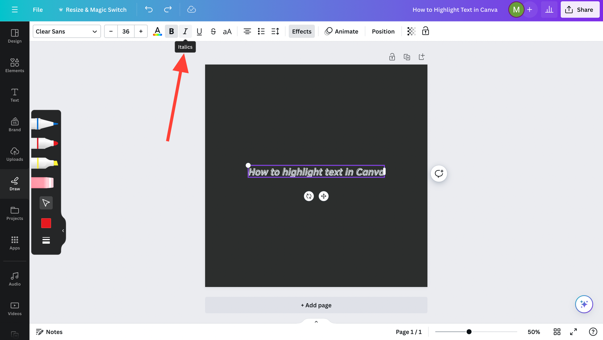
- Bold: Use to highlight headings or important information, making it stand out.
- Italic: Can be used for quotes, references, or to provide a stylistic distinction.
A clear layout with high contrast between text and background ensures that all text, whether it's a heading, subheading, or body text, is instantly noticeable and easily readable. The appropriate use of contrasting colors, along with proper bold and italic formatting, facilitates emphasis where needed and contributes to a more dynamic and engaging design.
Practical Applications
Highlighting text in Canva is a versatile technique that they can apply across various design projects to draw attention to key information.
Designing for Social Media Content
When designing social media content, the ability to highlight text is essential for making key phrases or call-to-action elements stand out. For instance, on a promotional Instagram post, one might use a bold color behind the text to emphasize a discount code or a limited-time offer. Similarly, for Facebook event announcements, designers often use highlights to draw attention to dates, venues, or RSVP instructions.
- Instagram Post Example
- Highlight "Sale Ends Tonight!" with a bright yellow.
- Facebook Event Example
- Emphasize "Register by May 1st" with a subtle underline.
Canva Tips and Tricks
Maximizing the effectiveness of highlighted text in Canva involves focusing on the parts that need emphasis and harnessing keyboard shortcuts. These hacks elevate the design by drawing attention to the most important information.
Highlighting Specific Text Parts
When one needs to highlight only specific text or a few words within a block of text, they can leverage the highlighter tool within Canva. This is especially useful for key phrases or terms that they want to stand out.
- Apply a highlighter tool:
- Select the text box containing the desired text.
- Choose a highlight color, often bright like neon, to make the specific part stand out.
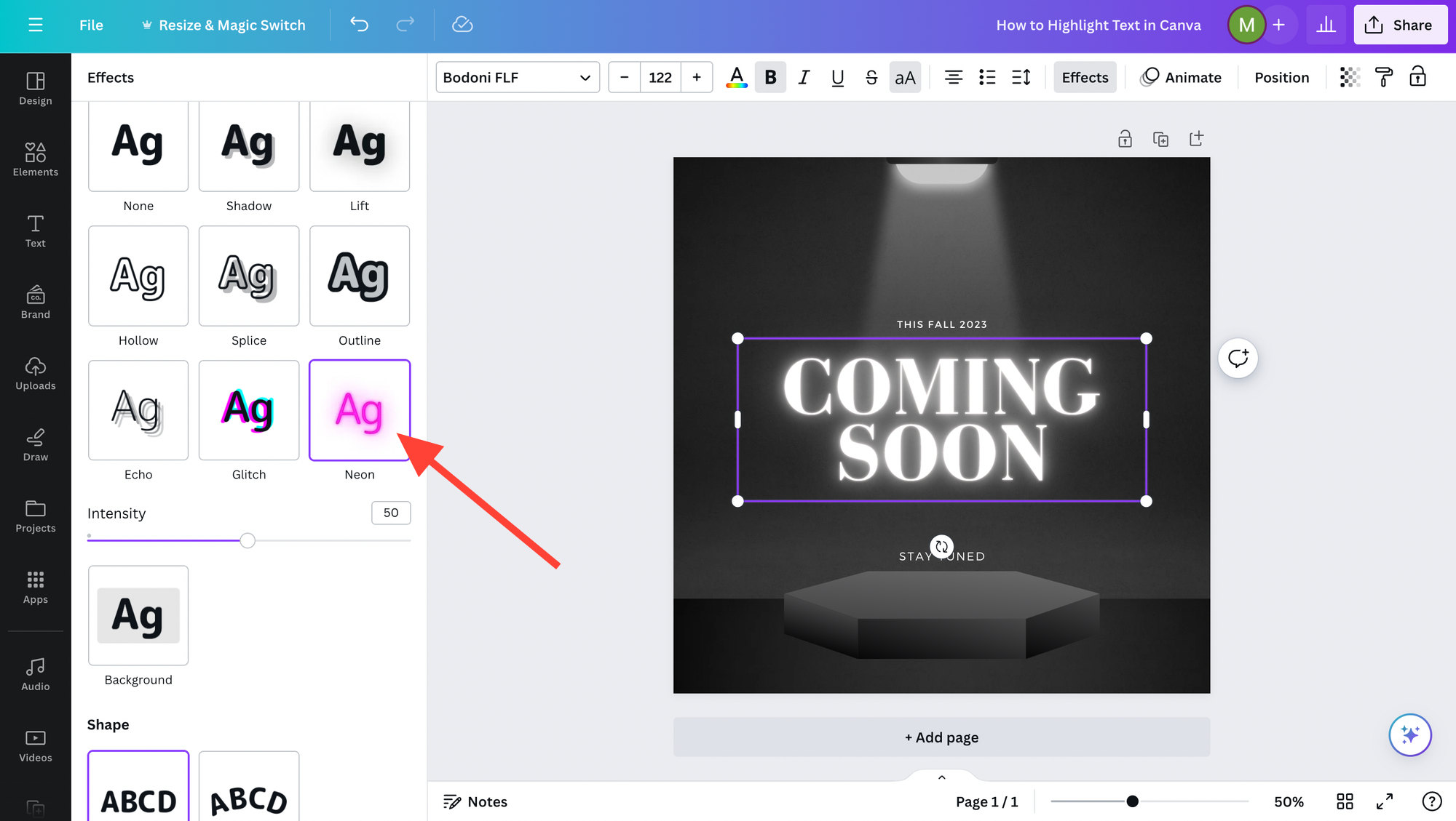
In addition, consider changing the font weight to bold for the selected text, which can be done quickly with the bold feature in Canva. This will ensure that the changes are immediately visible and the text is emphasized.
Mastering Keyboard Shortcuts
Efficiency in design work can be vastly improved by learning and using keyboard shortcuts. They allow for quick formatting changes without taking one's hands off the keyboard, which saves time.
- Key Canva Shortcuts:
- B for bold: Make text bold instantly.
- C for color: Open the color picker tool.
By keeping these tips in mind, the user can draw attention precisely where it's needed, with minimal effort and maximum impact.
Frequently Asked Questions
When working with Canva, users may have specific questions on how to enhance their text for more visually engaging designs. The following FAQs are aimed at assisting users in navigating Canva’s features efficiently.
What steps are involved in changing the background color of text in Canva?
To change the background color of text in Canva, one must first insert a shape behind the text and then adjust the color of that shape to create a highlight effect. There isn't a direct way to change text background within the text settings, but shapes offer a flexible solution.
How can you underline text within a Canva design project?
Canva does not provide a direct underline text feature. Users can create an underline effect by adding a line element beneath the text or by using the border feature in the effects menu to underline the text.
Where can you find the Effects button to enhance text in Canva?
The Effects button is located on the text editing menu bar at the top of the canvas when a text element is selected. It enables users to apply various styles such as shadows, curves, and neon effects to their text.
Could you provide guidance on how to design captivating text elements in Canva?
To design captivating text elements in Canva, users can experiment with different fonts, adjust the text size, and integrate effects for added dimension. Layering text with images and adjusting transparency can also contribute to an engaging design.
What methods are available for emphasizing text to make it stand out in Canva?
Users can emphasize text in Canva by applying bold or italic formatting, changing font size, using contrasting colors, or adding effects like a drop shadow. Placing the text over geometric shapes can also make it stand out.
How is it possible to create a highlighted line effect around text in Canva?
Creating a highlighted line effect around text in Canva involves adding a shape element behind the text and resizing it to frame the text closely. This method simulates a highlighter mark, accentuating the enclosed text.